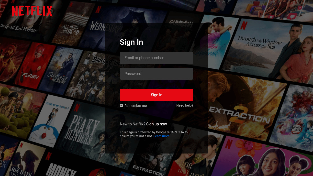
As one of the most popular streaming platforms worldwide, Netflix has a user-friendly login page that captures our attention with its sleek and intuitive design. Have you ever wondered how they create such a visually appealing login page? Well, Look no further!
In this beginner-friendly blog post, I’ll walk you through the process of creating a responsive Netflix login page using only HTML and CSS. You’ll learn how to create interactive and responsive forms, position elements on the page, and style them to match the Netflix aesthetic.
By the end of this blog post, you’ll understand how HTML and CSS work together to create a visually appealing and user-friendly form that looks great on all devices. So, let’s waste no time and start the steps to creating a Netflix login form page!
Steps To Create Netflix Login Page in HTML and CSS
To create a Netflix login or sign-in page using HTML and CSS, follow these step-by-step instructions:
- Create a folder. You can name this folder whatever you want, and inside this folder, create the mentioned files.
- Create an
index.htmlfile. The file name must be index and its extension .html - Create a
style.cssfile. The file name must be style and its extension .css - Download and place the Images folder in your project directory. This folder includes the Netflix logo and the hero background image.
To start, add the following HTML codes to your index.html file: This code includes various elements such as navigation, headings, paragraphs, a form, input fields, a button, and links. I’ve also included default form validation using the required attribute in the input elements.
<!DOCTYPE html>
<!-- Coding By CodingNepal - www.codingnepalweb.com -->
<html lang="en">
<head>
    <meta charset="UTF-8">
    <meta name="viewport" content="width=device-width, initial-scale=1.0">
    <title>Netflix Login Page | CodingNepal</title>
    <link rel="stylesheet" href="style.css">
</head>
<body>
    <nav>
        <a href="#"><img src="images/logo.svg" alt="logo"></a>
    </nav>
    <div class="form-wrapper">
        <h2>Sign In</h2>
        <form action="#">
            <div class="form-control">
                <input type="text" required>
                <label>Email or phone number</label>
            </div>
            <div class="form-control">
                <input type="password" required>
                <label>Password</label>
            </div>
            <button type="submit">Sign In</button>
            <div class="form-help">
                <div class="remember-me">
                    <input type="checkbox" id="remember-me">
                    <label for="remember-me">Remember me</label>
                </div>
                <a href="#">Need help?</a>
            </div>
        </form>
        <p>New to Netflix? <a href="#">Sign up now</a></p>
        <small>
            This page is protected by Google reCAPTCHA to ensure you're not a bot.
            <a href="#">Learn more.</a>
        </small>
    </div>
</body>
</html>
Next, add the following CSS codes to your style.css file to achieve a design that looks like the Netflix login page. This code includes different styles for elements such as color, font, background, border, etc., and makes the page responsive for all devices. Feel free to customize these styles according to your preferences.
@import url("https://fonts.googleapis.com/css2?family=Roboto:wght@400;500;600;700&display=swap");

* {
    margin: 0;
    padding: 0;
    box-sizing: border-box;
    font-family: 'Roboto', sans-serif;
}

body {
    background: #000;
}

body::before {
    content: "";
    position: absolute;
    left: 0;
    top: 0;
    opacity: 0.5;
    width: 100%;
    height: 100%;
    background: url("images/hero-img.jpg");
    background-position: center;
}

nav {
    position: fixed;
    padding: 25px 60px;
    z-index: 1;
}

nav a img {
    width: 167px;
}

.form-wrapper {
    position: absolute;
    left: 50%;
    top: 50%;
    border-radius: 4px;
    padding: 70px;
    width: 450px;
    transform: translate(-50%, -50%);
    background: rgba(0, 0, 0, .75);
}

.form-wrapper h2 {
    color: #fff;
    font-size: 2rem;
}

.form-wrapper form {
    margin: 25px 0 65px;
}

form .form-control {
    height: 50px;
    position: relative;
    margin-bottom: 16px;
}

.form-control input {
    height: 100%;
    width: 100%;
    background: #333;
    border: none;
    outline: none;
    border-radius: 4px;
    color: #fff;
    font-size: 1rem;
    padding: 0 20px;
}

.form-control input:is(:focus, :valid) {
    background: #444;
    padding: 16px 20px 0;
}

.form-control label {
    position: absolute;
    left: 20px;
    top: 50%;
    transform: translateY(-50%);
    font-size: 1rem;
    pointer-events: none;
    color: #8c8c8c;
    transition: all 0.1s ease;
}

.form-control input:is(:focus, :valid)~label {
    font-size: 0.75rem;
    transform: translateY(-130%);
}

form button {
    width: 100%;
    padding: 16px 0;
    font-size: 1rem;
    background: #e50914;
    color: #fff;
    font-weight: 500;
    border-radius: 4px;
    border: none;
    outline: none;
    margin: 25px 0 10px;
    cursor: pointer;
    transition: 0.1s ease;
}

form button:hover {
    background: #c40812;
}

.form-wrapper a {
    text-decoration: none;
}

.form-wrapper a:hover {
    text-decoration: underline;
}

.form-wrapper :where(label, p, small, a) {
    color: #b3b3b3;
}

form .form-help {
    display: flex;
    justify-content: space-between;
}

form .remember-me {
    display: flex;
}

form .remember-me input {
    margin-right: 5px;
    accent-color: #b3b3b3;
}

form .form-help :where(label, a) {
    font-size: 0.9rem;
}

.form-wrapper p a {
    color: #fff;
}

.form-wrapper small {
    display: block;
    margin-top: 15px;
    color: #b3b3b3;
}

.form-wrapper small a {
    color: #0071eb;
}

@media (max-width: 740px) {
    body::before {
        display: none;
    }

    nav, .form-wrapper {
        padding: 20px;
    }

    nav a img {
        width: 140px;
    }

    .form-wrapper {
        width: 100%;
        top: 43%;
    }

    .form-wrapper form {
        margin: 25px 0 40px;
    }
}
Conclusion and Final Words
In conclusion, creating a Netflix-inspired login page can be a valuable project for beginner web developers. It provides a great opportunity to dive into various aspects of web development, such as creating responsive forms, styling elements, and even incorporating floating label input animations.
By following the steps outlined in this post, I hope you’re able to create a responsive Netflix login page using only HTML and CSS. To understand the code better, you should experiment with it. To further enhance your web development skills, I recommend you try recreating the other login form designs that are available on this website.
If you encounter any problems while creating your Netflix login page, you can download the source code files for this Netflix login or sign-in page project for free by clicking the Download button. You can also view a live demo of it by clicking the View Live button.


